Thursday, 8 May 2014

Plot twist!

Bad news...the plans were rejected by the council on Monday. It's a slight set-back, but I am so determined to keep moving, so I call "PLOT TWIST!" (I love this quote).
There is absolutely no point sulking about the situation. I do not want to waste time with this project! All that we can do now is adjust the plans to the (vague) criteria we were provided with in the rejection letter and give it another shot.

The list of "no-nos" is filled with phrases like "should be" and "not recommended" which implies we could get away with the issue they're referring to. In particular, the stairs on the boundary wall "would not be recommended for approval". The architect told us we can do that if the neighbours allow it, and when we spoke to them they said they would. So, we'll try. The town planner mentioned something negative about "shear walls" in the rejection letter. I'm still yet to learn what a "shear wall" is (the town planner actually wrote "sheer wall" and when I googled it the spelling was incorrect #grammarpolice). The internet failed me. I didn't understand what I was reading even when I clicked "Did you mean 'shear wall?'".

Oops

I don't think there's anyone to blame in this situation. But I did wonder if having one of the newer architects from the firm as the main "plan drawer" had a small impact. I flipped through the plans we had submitted and found a few mistakes and noticed the areas that the town planner pointed out as issues. I do agree that the information we put forward could have been clearer. For example, the new window design we want for the WIRs downstairs. The window is currently about 1200m wide and we propose that a perpendicular wall will cut it in half (to form the two wardrobes). In the plans we submitted the windows look like this:

However, no where is there an annotation explaining how this would work or why we are doing this to persuade the council's approval. 

What irks me the most is the second chimney on the lean-to of the old house. It is yellow-brick, falling down, and CLEARLY an 80s DIY addition. We want it gone. Yet the council wants us to keep it - "retain and restore", to be exact.  BUT, again, no where in the plans does it say that particular chimney is not orginal. So the town planners probably assume it is the original chimney. I can tell you we won't give up this fight easily.

 This is a good lesson on being totally thorough with notes and details. They've asked for specifics like paint colours (except I have heard lots of interior designers advise choosing paint colours after your furniture is in the room so that you pick the right colour) and interior wall heights. We will be sure to give them in the next submission. What we put forward won't be a compromise (relevant cliché, "Don't settle for less"), just a different way of doing things. The plans will be an improvement, and hopefully a success.

I've already started drawing potential changes, as you could have guessed. I'll update you again next week once we have visited the architects.
XO


Sunday, 6 April 2014

Let me remind you...

As we wait in anticipation for the plans to be accepted by council, I thought I would rejig your memory about Almora's condition by sharing some candids I recently took. Probably the most notable difference to when I showed you the last lot of photos of the inside is that the kitchen is gone. It was in mint condition so we sold it on eBay and a lovely couple took it away. 

This is the state we are left with:
 Its absence makes the space feel so much bigger. You wouldn't believe the dirt that was accumulated over the last however many decades that kitchen was there - look at that pile of foam. Gross. Soon this area will be a thing of the past, as it will be demolished to make way for the new extension, in this order: study, middle entrance, stairs, pantry, kitchen, dining, and living.

Speaking of the past, I can't wait til this bathroom is a thing of it. Oh wait. It already is. #1970s


Here we are in the heritage zone. This is the middle room that will become the infamous walk-in-wardobes and my mum's gargantuan store room.  The window you see in this photo is going to be divided in half to service both wardrobes. Due to the heritage sructure the window has to remain. We could just board it up, but we opted for natural light. Doing so means that the layout of the wardrobe (i.e. hanging space, shelves, etc.) will need to be clever and out of direct sunlight as it will make the clothes fade. The fireplace will be boarded up, with half of it my wardrobe - only taking up 60x40cm of floor space - and the other half in the store room.

 
I can't decide if I think the hallway is long or short.  From memory it is about 11 metres long. We used to have a double fronted Victorian, so the hallway was only 2/3 of this one (two rooms either side, not three on one side). Do you remember the grotty persian rug that was down this hallway? The floor looks so much better without it. You might also remember the very noticeable lean down to the right. We had the floors restumped and now it is not so bad - still there ever so slightly, but bearable. In this photo the hall appears quite light-filled. There is a wide-ish window about two metres above the ground on the left, just past the archway, that lets west light in. We are lucky to have that already built. It would have been added in the 80s or thereabouts before heritage restrictions were in place. We can't alter it, but we can leave it there, and we will because without it the hallway would be a lot darker.

 
 This photo is of my room and its off-centre window. Due to the dimenions of the room, my bed will have to be placed underneath this window. However, the window is totally off-centre, and there is not enough room to have the bed (a queen) centred unerneath, as the walkway into the wardrobe would be too narrow. It is a total eye-sore. I was hoping to have a third of the window boarded up to make it more balanced. Except I don't know if this will be possible because it would mean altering the facade of the heritage zone.
  

 This is the view from the pink living room to the kitchen/dining area.

I have told you about the enormous pine tree on numerous occasions but I haven't shown you just how much of a lean this tree has! This particular photo is so deceving...


...until you see this!


It's practically falling over! And the sad thing is, I don't think people are in the market for the leaning tree of palm.  And the even sadder thing is that a supposed tree expert reckons it would have to be chopped up to be removed. Is our dream of some extra cashola in the pocket from the sale of this tree simply just a dream? I think I'd rather get the opinion from a professional tree removalist.


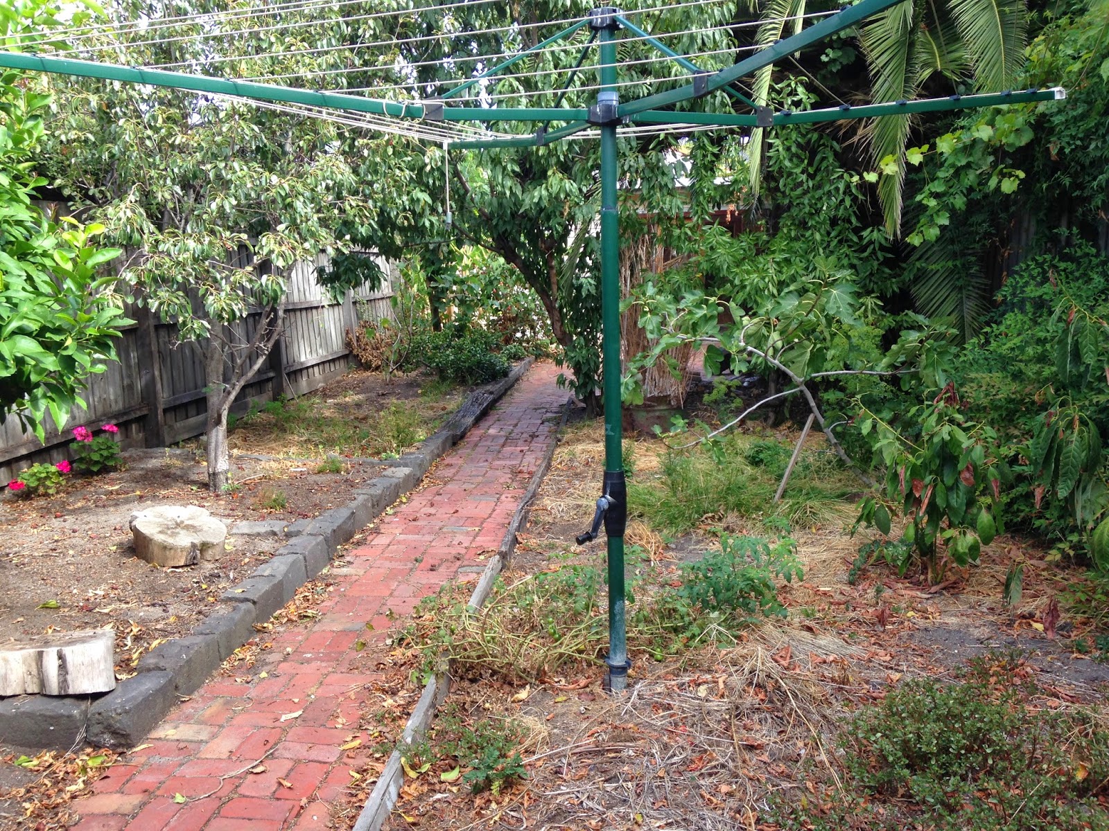
This garden actually used to be a jungle. Believe it or not, it has come a long way! Still lots of trees and plants to be removed, and the endless weeding, oh, and the extension to be built, before it becomes a lovely landscaped eden. 

Happy Sunday
xo

Friday, 21 March 2014

Submitted to Council

It was the 2nd of December, 2013 when we saw the early stages of professional house drawings come to light. This was 15 weeks ago. A process that was thought to take less than a month took three, but I can finally say we are all done! The plans are finished and are officially signed off to go to council. On Monday the plans will be submitted and we will be a big step closer towards the start of the build.

There were a few dramas before we committed to the final  drawings, namely the kitchen and middle entrance. The kitchen's issue was the lack of natural light due to the placement of the pantry. The architects rejigged it to make the pantry basically parallel with the stairs, but it left the flow of the kitchen unsettled becuase it was like the main work space was split up around a corner. 
Here's the elevation:


See what I mean by the corner? It's kind of like an L-shaped cross galley style kitchen. Personally, it's too weird and unconventional considering this house isn't intended to be iconic for new architecture trends. 

The second issue was the width of the door in the middle entrance. It was orginally about 900mm, slightly larger than a standard interior door. However, the purpose of this particular doorway is to make it comfortable for us and the guests when they are coming and going. The idea is to have it so two people can stand in the doorway and not do the awkward, "Come in, come in!" while walking backwards three metres to make room in the entrance, or at the end during goodbyes and you go to get the door with your guests right behind you but the door is too narrow for all of you to be within any proximity of each other that the guests have to step outside while the host leans on the door frame like the king of the castle. #obnoxious 

So, yeah, now its 1200mm . I hope it's wide enough, a lot of thought has gone into this.

The past two weekends saw us over at our neighbours' houses showing them our floorplans and discussing any effects there may be on their property (for example, the ginormous, leaning palm tree needs to be removed, but its roots are underneath the boundary fence, so a new fence will need to be erected.) Both sides of neighbours did not seem peturbed by any of our plans, save for the concern of the garage. The garage of one of the neighbours is dependent on ours, so if we pull it down the other will need to be supported. However, this isn't a problem right now, as the garage is not one of our priorities until a few years down the track.  

Both of the neighbours were appreciative that we had taken the time to come and speak to them personally. If you have been reading my blogs for the past few months you would probably notice the one short-term goal I kept referring to was council submission. And this is finally achieved! I can't wait to tell you when the plans have been approved, so I hope you're checking Casa Almora regularly to keep up to date!

Xo

P.S. To the readers who know me, I got my braces off today

Thursday, 13 February 2014

Almora in 3D

Finally! Finally Almora is in 3D (almost)! This morning we had another meeting at the architecture firm and were shown the latest floor plans and elevations. Not only was it cool to see the changes I proposed last time in a CAD drawing, but to be given a virtual tour of inside the house. 

And it was exactly how I imagined.

The interior's joinery (cupboards) are more modern and sleek looking than what I envision (Shaker-style doors throughout - pic below) but I can look past that because I know that's not set in stone. 

Source: http://www.channel4.com

What is more likely to be staying modern is the open tread stair. The reason for this is that the narrowness of the house calls for a greater sense of space. This is achieved with steps that have an open riser. Initially I was opposed to the skeletal look and contemporary style. I always imagined a traditional American balustrade, but currently it looks like it will be a glass panel. Now I'm thinking of the stairs as an impressive sculpture, a work of art. It should also bring the contemporary/traditional ratio that I like to 50:50.

Here is one angle of the kitchen and stairs: 

See what I mean by the modern kitchen? I think shaker style doors and open tread stairs won't juxtapose too much because of the consistent straight lines and edges. What I really don't like is the cylinder range hood (I think it looks like an exposed ceiling HVAC pipe) and how it hangs alone. It definitely needs to be flanked by overhead cupboards. 


This is the view from the kitchen out to the back yard. I love the fan windows above the bifolds, and how the whole end of the living room is glass. You can just see the legs of the pergola on the left. 


This is the rear elevation. It looks amazing in colour and in 3D on the computer, but you get the idea with this picture. I was always trying to avoid an asymmetrical look because I thought it would appear lopsided, but the architects have executed it really well. The screen on the first floor is going to be a bit shorter. It has to be incorporated for council regulations - you can't look down into the neighbours' gardens. The architect suggested louvres (amongst other ideas but this stood out the most) and this sort of style sprung to mind:

Source: http://www.homeoptiongallery.com.au/ 

There might be a second balcony attached to the living room upstairs for a southerly breeze. It might look similar to the one with louvres at the rear. The idea of it is to add more light to the room. And there's also a new window in the kitchen! It was going to be really dark but now there's a full length window just beside the pantry entrance. Speaking of the pantry, it is big. There are shelves on both sides, with counter space, and it manages to accommodate a huge fridge too. The kitchen is a little on the small side (to what we're used to) so storage needs to be maximised.

I am also stoked about the bedroom/wardrobe configuration. Now both bedrooms get a WIR and built-in desk, so floor space shouldn't be an issue. 


You can see the massive store room in between that I want to install a wrapping station into. Exuberant, I know. The downstairs bathroom is to the right of bedroom three. The architect had designed it with a wet room (a designated room behind glass for the bath and shower, i.e. a room to spray water absolutely everywhere). And both my parents and I were like, "uh, no." I'd be the one who'd have to wipe that room down! No thank you. I am very happy with a conventional shower and separate bath. It's a modern idea, and if it works for you then so be it, but not for us. So now the shower and bath are on opposite sides of the bathroom, the vanity is inbetween and the WC has stayed in the powder room.

After the meeting I asked one of my parents what they thought of the latest plans, expecting "they were absolutely brilliant. Let's ship them off to council right now!" Instead the response was along the lines of, "It's interesting to see how the architect's made it evolve" and "I'd like them to add some flesh to it" to which I said, "What does that even mean?" Personally, I'm super happy with it and I don't want to drag it out, but it's best to get everything planned to the nth degree now, before it gets too expensive to make changes. 

I hope you enjoyed today's blog! This meeting was the best so far, seeing a realistic visualisation of Almora was so, so cool. If you stick around you'll get to see even more.

Happy Vanlentines Day for Friday!
Xo


Friday, 24 January 2014

Two Months til Council

Just got back from the architecture firm and we went over the latest floor plans. Four things need to be revised: the bathroom/laundry configuration, the refrigerator location, the length of the study, and the placement of the stairs.

I designed the bathroom/laundry part of the house myself. There is a small passage where the separate WC and main bathroom are accessed from, and the laundry door is from the main hallway. However, the smaller passage is apparently taking up space, as is the already tiny laundry, which consequently makes the bathroom "too small". Personally, I thought I did a good job and I didn't have an issue with any of the dimensions. But we'll see what they come back with.

The refrigerator is located in the walk-in-pantry. However, it's adjacent to a wall at present and it is recommended to flank a fridge with cupboards or bench space. Why? Because when the fridge door opens against a wall, it doesn't open to its full extent. Some fridge designs have overcome this issue, but the reality is, most fridge doors need space to open. I toyed with the fridge having counter space either side but one of my parents wanted it moved. This issue could really be resolved by the kitchen cabinet maker if we wished. But if the architect has a solution then we are all ears.

The current study length is 4000mm by 1800mm wide. If you look at the plans it makes sense to have it narrow. Having it so long makes the hallway it is attached to appear even longer. So we want to see it shortened and have a bigger entrance way from the lightwell.

At present the stairs are just to the right of the entrance from the lightwell. However, being placed on the boundary means that the stairs have to go in a certain position to avoid affecting the neighbours as much in terms of height. One of the architects suggested flipping the stiars so that the first step up is basically from the kitchen area. It is actually more of a natural flow to do this because when you come through the back door from the garage, the stairs are a few metres in front of you.

The next time we visit the architects, the plans will be in 3D form. I believe the above revisions will be included. Once we approve them, and the land survey/engineer report (I think that's what it is) is carried out, the plans can go to council. This is supposed to be in two months from now.

In the mean time, we will sell the current kitchen unit on eBay, and the old fireplace mantles because they will be boarded up. We also need to hire a crane to remove the ginormous palm tree in the middle of the back yard (there is a photo in one of my other blog posts). Apparently they sell for quite a lot, so hopefully we make a good deal. Demolition is very expensive, so the more we can do ourselves, the more we save.

It's the long weekend! Happy Australia Day to all the Aussies reading this.
Xo the Kiwi

Thursday, 23 January 2014

Inspiration

It is about time that I post some inspiration photos for you all! I have seriously just figured out how to "embed" a photo onto my blog using a URL. So I am sharing some of my favourite interior design photos that I hope to mimick and appropriate in Almora.

To begin, this a utility room (basically a laundry) that doubles as a gift wrapping station. I am so obsessed with this idea because I love to wrap presents and to have so many wrapping papers and decorative ribbons to choose from, all organised so professionally, is just plain brilliant. Indulgent. But brilliant. In Almora, there is going to be a store room, so I am thinking one metre of the cupboards in there can be dedicated to wrapping paper and ribbons. Oh my gosh, the more I write about it the more ridiculous it sounds...


This living room has a gorgeous colonial window that works so well with the vaulted ceiling. We had a plan that involved a double-height ceiling (two-storeys) that would feature a magnificient window similar to this but then it got changed. Nevertheless, one day, I would love to have a room with a tall, grand window like this. I also love the sofas and throw cushions.


Now this is my absolute favourite photo of the minute, a Sarah Richardson Design creation. Sarah Richardson is my idol. Not a lot of people know that, they think Miley Cyrus is my favourite celebrity (she still is, but Sarah is like my life idol because she is an interior designer and her work is just fabulous). This particular bedroom is the current inspiration behind my bedroom I am designing for Almora. I love the colour palette - blue and green, black and white. I love the great use of pattern, becuase pattern is SO often forgotten in design. I believe it helps create a sense of traditional style, which is my style, I don't favour contemporary design. And pattern adds so much interest, as opposed to just block colour. I love the wainscoting on the wall too, which I hope to replicate in my room.

I have handmade a headboard that is similar in colour to the headboard in the photo, but with a baroque pattern. I also found very similar bedside tables from America that I nearly bought, but I think I'll wait until the house is finished and we are close to moving in before I order them. You can look at them here: http://www.lampsplus.com/products/trio-moderne-three-drawer-black-end-or-bedside-table__61481.html

If you want to see more of this bedroom, check out: http://www.sarahrichardsondesign.com/portfolio/sarah-101-season-2/kid-free-retreat


What I love about this WC is how feminine it looks. I think the pink orchard helps with this. But I also love the wainscoting and wall tile. I feel like bathrooms in Australia get neglected in terms of decoration. You can create a beautiful tile arrangement to border the room, just like in this photo, with dado tile and wainscoting. What I want to totally replicate in the separate WC in Almora is the basin. You would never guess it is from IKEA of all places! For $179 you can pick up this beauty and then customise it with a gorgeous faucet. See it here: http://www.ikea.com/au/en/catalog/products/90207143/


Look how beachy this living room is! I love Hamptons style (Revenge, anyone?) and I feel like this room is a great example of this. Especially the coffered ceiling, I would love to see Almora have a coffered ceiling. I think they add another dimension to the reality of "grand", but only if you have the height.


There you have it! You just got a glimpse into my favourite, inspiring interior design photos. You may have noticed I am highly influenced by American design, and not so much contemporary (clichéd) design. I find I am like that with fashion too, in the sense that I don't follow what the trend is right now, what everyone else is wearing.

Most of these photos came from Houzz.com. I recommend this website for every interior design idea you want to see or just for some inspiration. On the top right hand side of my blog you will find a link that will take you to my Houzz Ideabook.

Tomorrow we are revising the final floor plans for Almora with the architect! Yay!

Enjoy your Friday
xo

Sunday, 19 January 2014

Getting the ball rolling again

Welcome back to Casa Almora! I hope your holidays were filled with blissfulness and blessings, and that now you're ready for an update on the house.

Planning took a hiatus over Chirstmas and New Years. Surprisingly, I haven't missed constant progress on the plan's evolution over the past few weeks because I've been busy designing and making costumes for my school's annual drama performance. I have to create about 150 costumes and execute a set, along with my co-designer. Only within the last few days has there been any Almora progress for 2014.

The architect emailed my mum her consolidated version of my design that I drew up (a combination of all the favourite elements in the original propsoals), and good news, my sister and I get walk-in-robes! I was really pleased to see them becuase it meant my input was being appreciated. The overall look is quite similar to what I drew, but I don't want to take credit for their own design. The architect incorported 90% of my version (which was basically their work just recompiled) and added her own touch to a few places. For example, a screened balcony, a reconfigured laundry, and open-tread stairs. 

However, I changed a lot of it. Surprise, surprise. We measured out all of the plans inside of Almora to gain an understanding of the space and layout. It helped doing this inside the house because it created a more accurate vision. We also measured out potential changes to make. So in conjunction with my parents, I rearranged the laundry from being next to the kitchen to being adjacent to the downstairs bathroom; the bedrooms now have built in desks in alcoves to avoid crimping on floor space; I made the separate WC have natural light; the stairs are "closed-tread" and, reluctantly, against the boundary wall; the balcony was removed; and the middle living room which we dubbed "the library" (only becuase it had built-in bookshelves) is now a smaller reading nook to gain more garden space. 

These alterations are still in keeping with the bigger picture, and aren't so drastic as to offend the architect. To be fair to her, the ensuite bathroom layout is spot on, and I had trouble getting that right. As well as the ensuite, so is the main living/dining space, the windows in the lightwell, and the way the existing structure is being used to accomodate a new room with a new purpose.

I've said this before but I want to reiterate that the design has to be right. The house must work for you and support your lifestyle. It pays to plan the nitty-gritty details now in an attempt to prevent hiccups later on in the process that could have been avoided.

Later in the week we hope to meet with the architect and discuss the changes, but also say, "This is it." My family is very happy with the latest plans and would be willing to call them the final option. Hopefully they are, I really want to see them go to council and be approved!

Right now, as I wait for that day (actually, I'm waiting for my Real Housewives of Beverly Hills epsiode to download off iTunes) I am going to design the kitchen.

Ciao!
Xo