Thursday, 13 February 2014

Almora in 3D

Finally! Finally Almora is in 3D (almost)! This morning we had another meeting at the architecture firm and were shown the latest floor plans and elevations. Not only was it cool to see the changes I proposed last time in a CAD drawing, but to be given a virtual tour of inside the house. 

And it was exactly how I imagined.

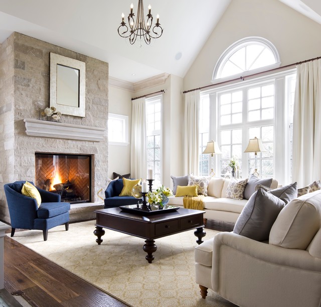
The interior's joinery (cupboards) are more modern and sleek looking than what I envision (Shaker-style doors throughout - pic below) but I can look past that because I know that's not set in stone. 

Source: http://www.channel4.com

What is more likely to be staying modern is the open tread stair. The reason for this is that the narrowness of the house calls for a greater sense of space. This is achieved with steps that have an open riser. Initially I was opposed to the skeletal look and contemporary style. I always imagined a traditional American balustrade, but currently it looks like it will be a glass panel. Now I'm thinking of the stairs as an impressive sculpture, a work of art. It should also bring the contemporary/traditional ratio that I like to 50:50.

Here is one angle of the kitchen and stairs: 

See what I mean by the modern kitchen? I think shaker style doors and open tread stairs won't juxtapose too much because of the consistent straight lines and edges. What I really don't like is the cylinder range hood (I think it looks like an exposed ceiling HVAC pipe) and how it hangs alone. It definitely needs to be flanked by overhead cupboards. 


This is the view from the kitchen out to the back yard. I love the fan windows above the bifolds, and how the whole end of the living room is glass. You can just see the legs of the pergola on the left. 


This is the rear elevation. It looks amazing in colour and in 3D on the computer, but you get the idea with this picture. I was always trying to avoid an asymmetrical look because I thought it would appear lopsided, but the architects have executed it really well. The screen on the first floor is going to be a bit shorter. It has to be incorporated for council regulations - you can't look down into the neighbours' gardens. The architect suggested louvres (amongst other ideas but this stood out the most) and this sort of style sprung to mind:

Source: http://www.homeoptiongallery.com.au/ 

There might be a second balcony attached to the living room upstairs for a southerly breeze. It might look similar to the one with louvres at the rear. The idea of it is to add more light to the room. And there's also a new window in the kitchen! It was going to be really dark but now there's a full length window just beside the pantry entrance. Speaking of the pantry, it is big. There are shelves on both sides, with counter space, and it manages to accommodate a huge fridge too. The kitchen is a little on the small side (to what we're used to) so storage needs to be maximised.

I am also stoked about the bedroom/wardrobe configuration. Now both bedrooms get a WIR and built-in desk, so floor space shouldn't be an issue. 


You can see the massive store room in between that I want to install a wrapping station into. Exuberant, I know. The downstairs bathroom is to the right of bedroom three. The architect had designed it with a wet room (a designated room behind glass for the bath and shower, i.e. a room to spray water absolutely everywhere). And both my parents and I were like, "uh, no." I'd be the one who'd have to wipe that room down! No thank you. I am very happy with a conventional shower and separate bath. It's a modern idea, and if it works for you then so be it, but not for us. So now the shower and bath are on opposite sides of the bathroom, the vanity is inbetween and the WC has stayed in the powder room.

After the meeting I asked one of my parents what they thought of the latest plans, expecting "they were absolutely brilliant. Let's ship them off to council right now!" Instead the response was along the lines of, "It's interesting to see how the architect's made it evolve" and "I'd like them to add some flesh to it" to which I said, "What does that even mean?" Personally, I'm super happy with it and I don't want to drag it out, but it's best to get everything planned to the nth degree now, before it gets too expensive to make changes. 

I hope you enjoyed today's blog! This meeting was the best so far, seeing a realistic visualisation of Almora was so, so cool. If you stick around you'll get to see even more.

Happy Vanlentines Day for Friday!
Xo


Friday, 24 January 2014

Two Months til Council

Just got back from the architecture firm and we went over the latest floor plans. Four things need to be revised: the bathroom/laundry configuration, the refrigerator location, the length of the study, and the placement of the stairs.

I designed the bathroom/laundry part of the house myself. There is a small passage where the separate WC and main bathroom are accessed from, and the laundry door is from the main hallway. However, the smaller passage is apparently taking up space, as is the already tiny laundry, which consequently makes the bathroom "too small". Personally, I thought I did a good job and I didn't have an issue with any of the dimensions. But we'll see what they come back with.

The refrigerator is located in the walk-in-pantry. However, it's adjacent to a wall at present and it is recommended to flank a fridge with cupboards or bench space. Why? Because when the fridge door opens against a wall, it doesn't open to its full extent. Some fridge designs have overcome this issue, but the reality is, most fridge doors need space to open. I toyed with the fridge having counter space either side but one of my parents wanted it moved. This issue could really be resolved by the kitchen cabinet maker if we wished. But if the architect has a solution then we are all ears.

The current study length is 4000mm by 1800mm wide. If you look at the plans it makes sense to have it narrow. Having it so long makes the hallway it is attached to appear even longer. So we want to see it shortened and have a bigger entrance way from the lightwell.

At present the stairs are just to the right of the entrance from the lightwell. However, being placed on the boundary means that the stairs have to go in a certain position to avoid affecting the neighbours as much in terms of height. One of the architects suggested flipping the stiars so that the first step up is basically from the kitchen area. It is actually more of a natural flow to do this because when you come through the back door from the garage, the stairs are a few metres in front of you.

The next time we visit the architects, the plans will be in 3D form. I believe the above revisions will be included. Once we approve them, and the land survey/engineer report (I think that's what it is) is carried out, the plans can go to council. This is supposed to be in two months from now.

In the mean time, we will sell the current kitchen unit on eBay, and the old fireplace mantles because they will be boarded up. We also need to hire a crane to remove the ginormous palm tree in the middle of the back yard (there is a photo in one of my other blog posts). Apparently they sell for quite a lot, so hopefully we make a good deal. Demolition is very expensive, so the more we can do ourselves, the more we save.

It's the long weekend! Happy Australia Day to all the Aussies reading this.
Xo the Kiwi

Thursday, 23 January 2014

Inspiration

It is about time that I post some inspiration photos for you all! I have seriously just figured out how to "embed" a photo onto my blog using a URL. So I am sharing some of my favourite interior design photos that I hope to mimick and appropriate in Almora.

To begin, this a utility room (basically a laundry) that doubles as a gift wrapping station. I am so obsessed with this idea because I love to wrap presents and to have so many wrapping papers and decorative ribbons to choose from, all organised so professionally, is just plain brilliant. Indulgent. But brilliant. In Almora, there is going to be a store room, so I am thinking one metre of the cupboards in there can be dedicated to wrapping paper and ribbons. Oh my gosh, the more I write about it the more ridiculous it sounds...


This living room has a gorgeous colonial window that works so well with the vaulted ceiling. We had a plan that involved a double-height ceiling (two-storeys) that would feature a magnificient window similar to this but then it got changed. Nevertheless, one day, I would love to have a room with a tall, grand window like this. I also love the sofas and throw cushions.


Now this is my absolute favourite photo of the minute, a Sarah Richardson Design creation. Sarah Richardson is my idol. Not a lot of people know that, they think Miley Cyrus is my favourite celebrity (she still is, but Sarah is like my life idol because she is an interior designer and her work is just fabulous). This particular bedroom is the current inspiration behind my bedroom I am designing for Almora. I love the colour palette - blue and green, black and white. I love the great use of pattern, becuase pattern is SO often forgotten in design. I believe it helps create a sense of traditional style, which is my style, I don't favour contemporary design. And pattern adds so much interest, as opposed to just block colour. I love the wainscoting on the wall too, which I hope to replicate in my room.

I have handmade a headboard that is similar in colour to the headboard in the photo, but with a baroque pattern. I also found very similar bedside tables from America that I nearly bought, but I think I'll wait until the house is finished and we are close to moving in before I order them. You can look at them here: http://www.lampsplus.com/products/trio-moderne-three-drawer-black-end-or-bedside-table__61481.html

If you want to see more of this bedroom, check out: http://www.sarahrichardsondesign.com/portfolio/sarah-101-season-2/kid-free-retreat


What I love about this WC is how feminine it looks. I think the pink orchard helps with this. But I also love the wainscoting and wall tile. I feel like bathrooms in Australia get neglected in terms of decoration. You can create a beautiful tile arrangement to border the room, just like in this photo, with dado tile and wainscoting. What I want to totally replicate in the separate WC in Almora is the basin. You would never guess it is from IKEA of all places! For $179 you can pick up this beauty and then customise it with a gorgeous faucet. See it here: http://www.ikea.com/au/en/catalog/products/90207143/


Look how beachy this living room is! I love Hamptons style (Revenge, anyone?) and I feel like this room is a great example of this. Especially the coffered ceiling, I would love to see Almora have a coffered ceiling. I think they add another dimension to the reality of "grand", but only if you have the height.


There you have it! You just got a glimpse into my favourite, inspiring interior design photos. You may have noticed I am highly influenced by American design, and not so much contemporary (clichéd) design. I find I am like that with fashion too, in the sense that I don't follow what the trend is right now, what everyone else is wearing.

Most of these photos came from Houzz.com. I recommend this website for every interior design idea you want to see or just for some inspiration. On the top right hand side of my blog you will find a link that will take you to my Houzz Ideabook.

Tomorrow we are revising the final floor plans for Almora with the architect! Yay!

Enjoy your Friday
xo

Sunday, 19 January 2014

Getting the ball rolling again

Welcome back to Casa Almora! I hope your holidays were filled with blissfulness and blessings, and that now you're ready for an update on the house.

Planning took a hiatus over Chirstmas and New Years. Surprisingly, I haven't missed constant progress on the plan's evolution over the past few weeks because I've been busy designing and making costumes for my school's annual drama performance. I have to create about 150 costumes and execute a set, along with my co-designer. Only within the last few days has there been any Almora progress for 2014.

The architect emailed my mum her consolidated version of my design that I drew up (a combination of all the favourite elements in the original propsoals), and good news, my sister and I get walk-in-robes! I was really pleased to see them becuase it meant my input was being appreciated. The overall look is quite similar to what I drew, but I don't want to take credit for their own design. The architect incorported 90% of my version (which was basically their work just recompiled) and added her own touch to a few places. For example, a screened balcony, a reconfigured laundry, and open-tread stairs. 

However, I changed a lot of it. Surprise, surprise. We measured out all of the plans inside of Almora to gain an understanding of the space and layout. It helped doing this inside the house because it created a more accurate vision. We also measured out potential changes to make. So in conjunction with my parents, I rearranged the laundry from being next to the kitchen to being adjacent to the downstairs bathroom; the bedrooms now have built in desks in alcoves to avoid crimping on floor space; I made the separate WC have natural light; the stairs are "closed-tread" and, reluctantly, against the boundary wall; the balcony was removed; and the middle living room which we dubbed "the library" (only becuase it had built-in bookshelves) is now a smaller reading nook to gain more garden space. 

These alterations are still in keeping with the bigger picture, and aren't so drastic as to offend the architect. To be fair to her, the ensuite bathroom layout is spot on, and I had trouble getting that right. As well as the ensuite, so is the main living/dining space, the windows in the lightwell, and the way the existing structure is being used to accomodate a new room with a new purpose.

I've said this before but I want to reiterate that the design has to be right. The house must work for you and support your lifestyle. It pays to plan the nitty-gritty details now in an attempt to prevent hiccups later on in the process that could have been avoided.

Later in the week we hope to meet with the architect and discuss the changes, but also say, "This is it." My family is very happy with the latest plans and would be willing to call them the final option. Hopefully they are, I really want to see them go to council and be approved!

Right now, as I wait for that day (actually, I'm waiting for my Real Housewives of Beverly Hills epsiode to download off iTunes) I am going to design the kitchen.

Ciao!
Xo

Thursday, 19 December 2013

Kitchen Planning

I'm having withdrawals from the floor plans right now. I didn't take a photo of my compiled floor plan for me to look at (I mean so I can obsess over it in a moment of procrastination from other tasks) or to show other people in the family what the current plans are before the architect took it. So not only am I missing looking at the floor plan I'm kicking myself for not making a copy of it.

I keep telling myself it's good that they have my floor plan because it means progress is being made on coming to a final design. But this doesn't make up for not having the tangible paper in front of me. So to make up for the missing floor plan, I decided to refine the kitchen layout.

In my version of the floor plan, I did a different layout to what the architect had done. But I was never quite satisfied with its functionality. And I forgot to put a pantry in. In my defence I thought there would be a walk-in-pantry from the door you'll see in the elevation I've included. Except that room may now become a store room. This gave me all the more reason to rejig the floor plan as opposed to just wanting to swoon over architectural plans (I'm actually obsessed with floor plans. Can you tell?)

So this is what I came up with:
It's super super basic, but it helps with visualising the floor plan. I used EZ-Archietct to create this.

I just wanted to document my feelings right now and share them with you. I'm also curious to see how close the finished kitchen will be to the one I've designed. This is probably more interior design focused than floor plan configuring, but I've enjoyed both so far.

There'll be another post in January about the architect's consolidated version of my combined plans so look out for it in the new year.

Six sleeps til Christmas!
Xo

Friday, 13 December 2013

Consolidation Phase

The architect came to our house this morning to discuss the plan to be refined and consolidated. Out of all four concepts we were provided with, I combined #1's upstairs, #2's sitting room, and #3's main living extension into one. I designed the front part myself, as the previous post tells you in extreme detail.

However, despite my efforts to combine everyone's favourite aspects, there are some elements that haven't been incorporated in a way that is practical and compact. For instance, a linen cupboard, laundry counter space, or a utility closet (for the vacuum, etc). As well as that, everyone except my sister and I seems to think the WIRs I have designed for us are "too indulgent" and excessive in space. Of course I disagree. I'm so hung up on these wardrobes - no pun intended - because I have had a bedroom in 3.6 x 3.6m room before and it was cramped. And that was when I had a double bed, not a queen. Wardrobes and other bedroom furniture take up a lot of space. I don't want my room to be claustrophobic and everywhere else to be spacious and grand. 

There are multiple options to solve these small issues, it just comes down to finding one that pleases everyone and doesn't compromise anything important (to me, wardrobe space). The architect has taken my plans that I hand drew to "consolidate" and hopefully incorporate solutions that are satisfactory. We get to see them next year in early January. Then, fingers crossed, if we love them they will be submitted to council and all of the necessary advertising and approval will go ahead.

The overall time frame could still possibly be til the end of 2014. Right now I'm looking forward to seeing final plans go to council.

Enjoy the holiday season everyone!
Xo

Tuesday, 3 December 2013

Designs to Refine


I have just come back from seeing the architect's four different concepts for Almora, and they are totally not what I expected - in a good way! Each design has its own different attributes, but there are a few constant similarities between them all because the site is difficult to work with. In a sense that is a positive thing, because we won't get carried away with hundreds of different options. We've been limited to the four created by the architect and her colleagues, and now we have until Friday week to choose our favourite to refine (which means build upon, develop, perfect, etc.). 

Out of all of the options my favourite is number three. I'll give you a little visual of one area of the design:

 I love this extension the most. The kitchen being in the centre of the south wall as opposed to right at the back squashed into the side wall seems much more balanced and functional. I love how the living area peninsulas out from the dining area. I love the flow from laundry to kitchen - something about the circular flow is really appealing. And having extra storage right next to the kitchen is a bonus too. But I feel like the island is a little small, especially compared to my design of the kitchen. I'm thinking the dining area could be less wide, and maybe also have an inward jut of about 1000mm to fit a light-well, instead of the cupboards. I had this idea in my own plans and I really like the extra light plus a vertical garden.

It's hard to try and somewhat let go of my own design for Almora. I have to understand and accept what is more likely to be possible and more economical (financially) for the site and its surroundings, plus be flexible in exploring other design possibilities. However, I don't favour any of the designs for the heritage rooms at the front of the property. This is where I am bringing my own design to the table. Most of the architect's concepts have a bedroom, a bathroom/laundry, another bedroom, a living space, followed by a light well. But I am not a fan of this configuration. I don't know if I have mentioned it previously, but I have my heart set on walk-in-robes for the front two bedrooms, and I will fight to get them (despite one parent saying 'no' already, but here's my argument). Because the current bedroom sizes at the minute will be about 3800mm by 3800mm, floor space cannot be eaten by wardrobes, and two rooms have a fireplace that I want to get rid of for the same reason. They're lovely pieces of history, but so redundant in this day and age. So I want them gone, and I also don't want wardrobes to flank the fireplaces either side. This configuration is SO common in heritage houses but SO unaesthetically pleasing. You see, fireplaces usually jut out 400 or 500mm from the wall. Wardrobes require a depth of at least 600mm. Therefore, there is a discrepancy in how flush the wardrobe and fireplace are, of about 200mm (20cm). And it is ugly. I will not allow it in my room. As an Interior Designer (as I like to think of my self) I am putting my foot down. (What happened to being flexible? Hey, interior designers are supposed to develop better functioning spaces, i.e. a WIR.)

When I came home I immediately scribbled down all of my ideas onto a piece of paper, then refined it on EZ Architect. I've since printed it and annotated the changes I want to incorporate into the option above. Mainly the changes centre around the front. I've drawn the first bedroom, followed by the WIR's , the second bedroom, then entering the current lean-to, a WC down a short hallway and the bathroom. After this, hopefully my most favoured extension will follow. I've eliminated the living space and light well for the front of the house because the main family area will be down the back and a sitting room will be upstairs. I think three is a little excessive for our household. But if the site length allows, then the third living area and the light well that the architect wants to accompany it with can be incorporated, I won't complain. I just see the WIR's (which I plan to fit a desk in that can be either for study or make-up) as more of a priority than a third TV-watching area. And if someone argues that it would be used a spare bedroom for guests, well what's wrong with the sofa bed in the second living room upstairs that can be sectioned off with a door? Besides, guests usually only stay for two or three nights.

I haven't quite discussed this in as full detail with my family. I see that my opinion is really of  lesser value than the bill payers' of this project, so I wonder if my thoughts will be considered seriously. I think they have good merit and reason, but I guess I'm biased. You know what, I'll get them to read this blog post. Hopefully they listen to me and take what I have to say on board, because I really want my big wardrobe that I can use for storage and study, and a bathroom that isn't partnered with a laundry. I always believe, "Go hard, or go home." This house has to feel like our dream house, and shouldn't involve compromises that we will regret later and make us unhappy or unsatisfied. I know it's not my house that I bought, but I get to live there. It would be nice if my bedroom gets to be a space that I can design and decorate however I like. Does anyone else agree?

Thank you to those readers who check back frequently and enjoy reading about Almora's progress! I know the length of my blogs are quite long but I want to remember every detail and have an archive that I can come back to for advice I wrote for my future self or just a trip down memory lane. It will be amazing to read over these past few posts in a couple of years...

Have a fabulous week everybody. Hopefully I can show you more plans soon!
xo