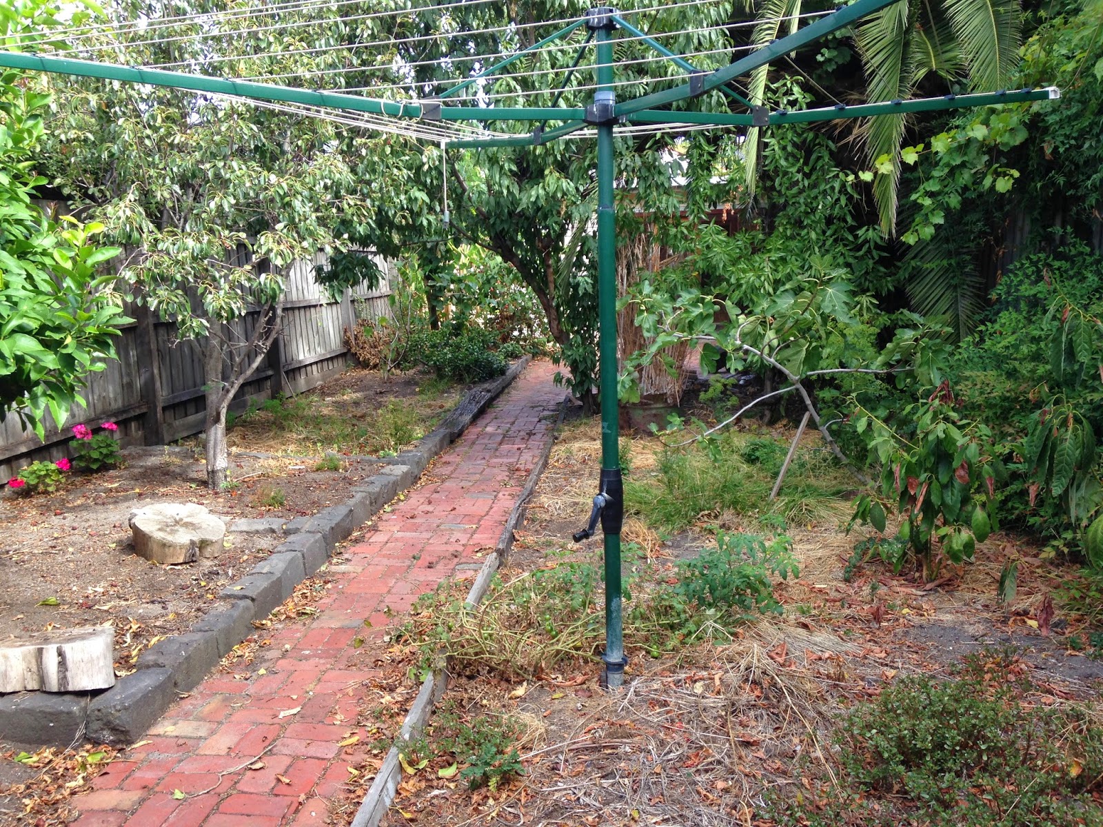
As we wait in anticipation for the plans to be accepted by council, I thought I would rejig your memory about Almora's condition by sharing some candids I recently took. Probably the most notable difference to when I showed you the last lot of photos of the inside is that the kitchen is gone. It was in mint condition so we sold it on eBay and a lovely couple took it away.
This is the state we are left with:
Its absence makes the space feel so much bigger. You wouldn't believe the dirt that was accumulated over the last however many decades that kitchen was there - look at that pile of foam. Gross. Soon this area will be a thing of the past, as it will be demolished to make way for the new extension, in this order: study, middle entrance, stairs, pantry, kitchen, dining, and living.
Speaking of the past, I can't wait til this bathroom is a thing of it. Oh wait. It already is. #1970s
Here we are in the heritage zone. This is the middle room that will
become the infamous walk-in-wardobes and my mum's gargantuan store
room. The window you see in this photo is going to be divided in half
to service both wardrobes. Due to the heritage sructure the window has
to remain. We could just board it up, but we opted for natural light.
Doing so means that the layout of the wardrobe (i.e. hanging space,
shelves, etc.) will need to be clever and out of direct sunlight as it
will make the clothes fade. The fireplace will be boarded up, with half
of it my wardrobe - only taking up 60x40cm of floor space - and the
other half in the store room.
I
can't decide if I think the hallway is long or short. From memory it
is about 11 metres long. We used to have a double fronted Victorian, so
the hallway was only 2/3 of this one (two rooms either side, not three
on one side). Do you remember the grotty persian rug that was down this
hallway? The floor looks so much better without it. You might also
remember the very noticeable lean down to the right. We had the floors
restumped and now it is not so bad - still there ever so slightly, but
bearable. In this photo the hall appears quite light-filled. There is a
wide-ish window about two metres above the ground on the left, just past
the archway, that lets west light in. We are lucky to have that already
built. It would have been added in the 80s or thereabouts before
heritage restrictions were in place. We can't alter it, but we can leave it there, and we will because without it the hallway would be a lot darker.
This
photo is of my room and its off-centre window. Due to the dimenions of
the room, my bed will have to be
placed underneath this window. However, the window is totally
off-centre,
and there is not enough room to have the bed (a queen) centred unerneath, as the
walkway into the wardrobe would be too narrow. It is a total eye-sore. I
was hoping to have a third of the window boarded up to make it more
balanced. Except I don't know if this will be possible because it would
mean altering the facade of the heritage zone.
This is the view from the pink living room to the kitchen/dining area.
I have told you about the enormous pine tree on numerous occasions but I haven't shown you just how much of a lean this tree has! This particular photo is so deceving...
...until you see this!
It's practically falling over! And the sad thing is, I don't think people are in the market for the leaning tree of palm. And the even sadder thing is that a supposed tree expert reckons it would have to be chopped up to be removed. Is our dream of some extra cashola in the pocket from the sale of this tree simply just a dream? I think I'd rather get the opinion from a professional tree removalist.
This garden actually used to be a jungle. Believe it or not, it has come a long way! Still lots of trees and plants to be removed, and the endless weeding, oh, and the extension to be built, before it becomes a lovely landscaped eden.
Happy Sunday
xo


